Weaving Chromatic Chords
Exhibition: Never Ending Poetry
Artist: Group Exhibition - Various Artists
Overview
Abstractions in art can often be created by layering materials, using multiple processes and sometimes even doing both at once. In Never Ending Poetry, Kim McCollum uses a computer program to translate original found pattern swatches in to full patterns that she then creates in paint. From textile, to computer, to painting, each process adds a new layer and further abstracts the original form, creating exciting new visual information. These layers of process add a depth of information to the final artwork.
In this exploration, participants will use basic weaving skills and colour psychology to translate
a meaningful poem or song in to an abstracted geometric weaving. The final result will be rich in coded visual language using colour association, chromatic sensation and personal interpretation.
Objectives
Be introduced to basic weaving techniques.
Create a visual composition on paper and translate into a weaving.
Explore a layered process approach to further develop your visual language.
Learn basic colour psychology and create chromatic chords that add meaning and feeling to geometric shapes.
Materials
Pencil
A few pieces 8.5 x 11 paper
Strong cardboard (corrugated) cut to 9” x 12”
Scissors
Ruler
Glue
Coloured yarn
Warp thread (thinner then your yarn)
Weaving needle/tapestry needle
Colour wheel to use for reference (or view online)

Instructions:
Step One
Choose a meaningful poem or song. Your choice should invoke personal meaning and feelings that you can use to interpret in to a visual representation using colour.
Read your poem or listen to your song. On a piece of paper write down your mood and feelings that the piece invokes, as well as any personal meaning behind the words.
Step Two
Colour influences perceptions and evokes emotions. We can apply principles of colour association when selecting colours in order to attach meaning and evoke a particular emotion or idea. This is a nuanced approach to create meaning as it is not always a direct form of communication, but one that can effect the viewer profoundly. Below is a brief list of colour associations that you can use as a resource to complete the following step.
You will notice throughout the associations below that all colours have both negative and positive connotations.
Black - night, darkness, hidden, forbidden, death, elegance, sober, weighted
White - birth, beginning, cleanliness, snow, coldness, ghosts, spirits, lightness
Grey - brain, mind, mental concentration, monotonous, poverty, nostalgia
Brown - wood, leather, warmth, comfortable, homey, dirty, foul, easy to mix with other colours because it contains them
Silver - metal, metallic, value, technology, speed, science, thought, science fiction
Gold - expensive, divine, pride, tyranny
Cool colours
Often described as calming but can also bring feeling of sadness or indifference
Blue - sky, water, immeasurable, stability, calm, peace, harmony, distant, unreachable, sadness, anguish, air, masculine
Green - growth, immaturity, health, freshness, forward, poisonous, putrid, zombies, inhuman,
Violet - magic, mysterious, seductive, royalty, forbidden, repentance, temptation
Cyan - freshness, relaxation
Warm colours
Range from feelings of warmth and comfort to feeling of anger and hostility
Red - blood, body, fire, warmth, energy, impulsivity, passion, hatred, anger, love, feminine, aggression
Yellow - gold, kindness, harmony, envy, jealousy, betrayal, energizing in small amounts, fatiguing in large amounts
Orange - fruit, fire, energy, speed, activity, instills hunger
Step Three
Using the colour associations listed above, select colours from your drawing materials that best fit the ideas that you wrote down in step one.

Step Four
With a basic understanding of colour association, we are going to look at how we can create a final palette and evoke the overall mood and feeling we desire. Chromatic chords are combinations of colours we use to create sensations. After all, the above colour associations are quite generalized. Ultimately it’s how a colour is used or what it is placed next to that will create the specific association that we desire.
For example, red on its own can imply a range of associations from anger to passion. When combined with yellow and orange, its association of heat and energy is emphasized and further defined. We can even further emphasize this feeling by placing it next to other colours. For example, when we put these warm colours in the surroundings of cold and icy blues— the warm glow of yellow, orange and red will feel even warmer in contrast.
Begin your colour studies by arranging your selected colours in different combinations on paper. You don’t have to use all the colours you selected in Step Three. For example, try selecting the colour that most evokes the mood you are aiming for, then combine it with various colour wheel combinations to see how they effect the perception of that colour. Use your colour wheel as reference and try numerous colour combinations before making a final decision about your colour palette.
Analogous - these are similar colours that are close on the colour wheel. They feel well balanced and tranquil, often seen in nature.
Complimentary- Colours opposite each other on the colour wheel, high contrast, difficult to balance in large doses but work well as accents. They can cause a discordance effect or create tension.
Monochromatic - using one single colour in various tints, shades and tones. This can be very soft and subtle, evermore so then analogous.
Step Five
You can use all of this information regarding colour theory as a starting point. But overall trust your intuition and take the time to play around with different combinations. You will be able to determine which palette to use as your final selection as it will evoke all the same feelings when you look at it as you felt while reading your poem or listening to your song. This is a completely personal interpretation.
Step Six
On a fresh sheet of paper, use your selected colour palette to start arranging the colours using different geometric shapes. Play with how you arrange the shapes, what colours go beside each other and in what amounts, and how does that further create a certain mood? Try different shapes, forms and lines in a way that you think also helps reflects the mood. Are they loose and wild, organized, consistent, stiff? Dizzying, complementary, competing? We will be transferring the final composition to a fresh sheet of paper, but first we will make our loom so that we are able size our final composition to fit.
Note: If you are new to weaving, remember to keep your composition fairly simple as will be translating it in to a weaving and don’t want to get too overwhelmed.
Step Seven
Create a simple weaving frame:
Cut a 9” x 12” piece of strong corrugated cardboard.
Use a ruler to find the middle of your cardboard and start marking off every 1/4” across the top of the cardboard. Leave 1” on each end and repeat on the bottom of the cardboard. Your top and bottom marks should align.
Cut each mark 1/4” deep.
Cut 2 pieces cardboard 9” x 1”. Glue these to your cardboard just under your cut tabs. One on the bottom and one on the top. This will help ease tension on your tabs and give you some weaving room underneath the warp threads.
Warp your loom. Tie a knot and put the knot at the back of the first tab on the bottom. Warp across the front of the loom. Bring the warp around the back of the loom and then back around the front. Keep warping until the end and tie your warp thread in a single knot at the back of the loom.


Step Eight
Take a sheet of 8.5 x 11 paper and make sure that it can slide under the warp threads and fit between each strip of glued cardboard. Trim as necessary. Once your paper is sized, transfer your final composition on to this piece of paper. Gather coloured yarn that matches your selections.

Step Nine
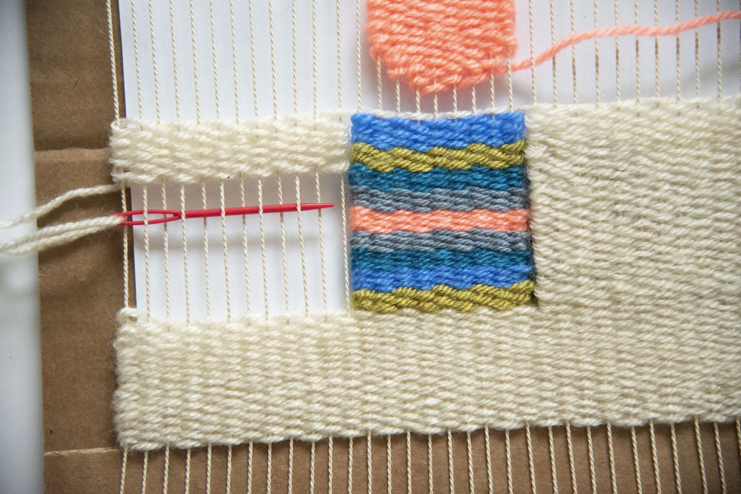
Slide your final sized composition under the warp threads on your loom. You will use this as your guide to follow while creating your weaving. We will be using a simple over and under weaving technique. Working left to right, pull the weft thread (horizontal) over the first warp thread (vertical) and then under, continue the repeating pattern of over and under. On your pass back, you are now starting from the opposite end working right to left. This pass will start the opposite as your previous in an under then over repeating pattern.
Begin by weaving your coloured shapes. Change yarn colours as needed. It is easiest to fill in all of your coloured shapes first, and then work around them, filling in your background once all of the shapes are completed.
Note: When working the sides of your weave, make sure to keep the yard ends loose and consistent tension so that your yarn rows don’t pull the warp threads.


Step Ten
Once your weaving is complete, cut the warp threads at the back centre of your cardboard loom. Carefully remove the warp threads from the bottom of the loom, keeping the top attached still. Begin pairing up the warp yarn with the piece next to it. Tie them in a loose knot right below where the weaving ends. Repeat this until all the warp threads are tied off. Remove the warp threads off the the top of your loom and repeat tying off.
Use a tapestry needle to weave all loose ends of your colour changes neatly in to the back of the weaving.
You can use the loose warp thread tassels to attach a small dowel for hanging or add more yarn to create thicker tassels. There are many tutorials available online depending on how you desire to display your weaving.
